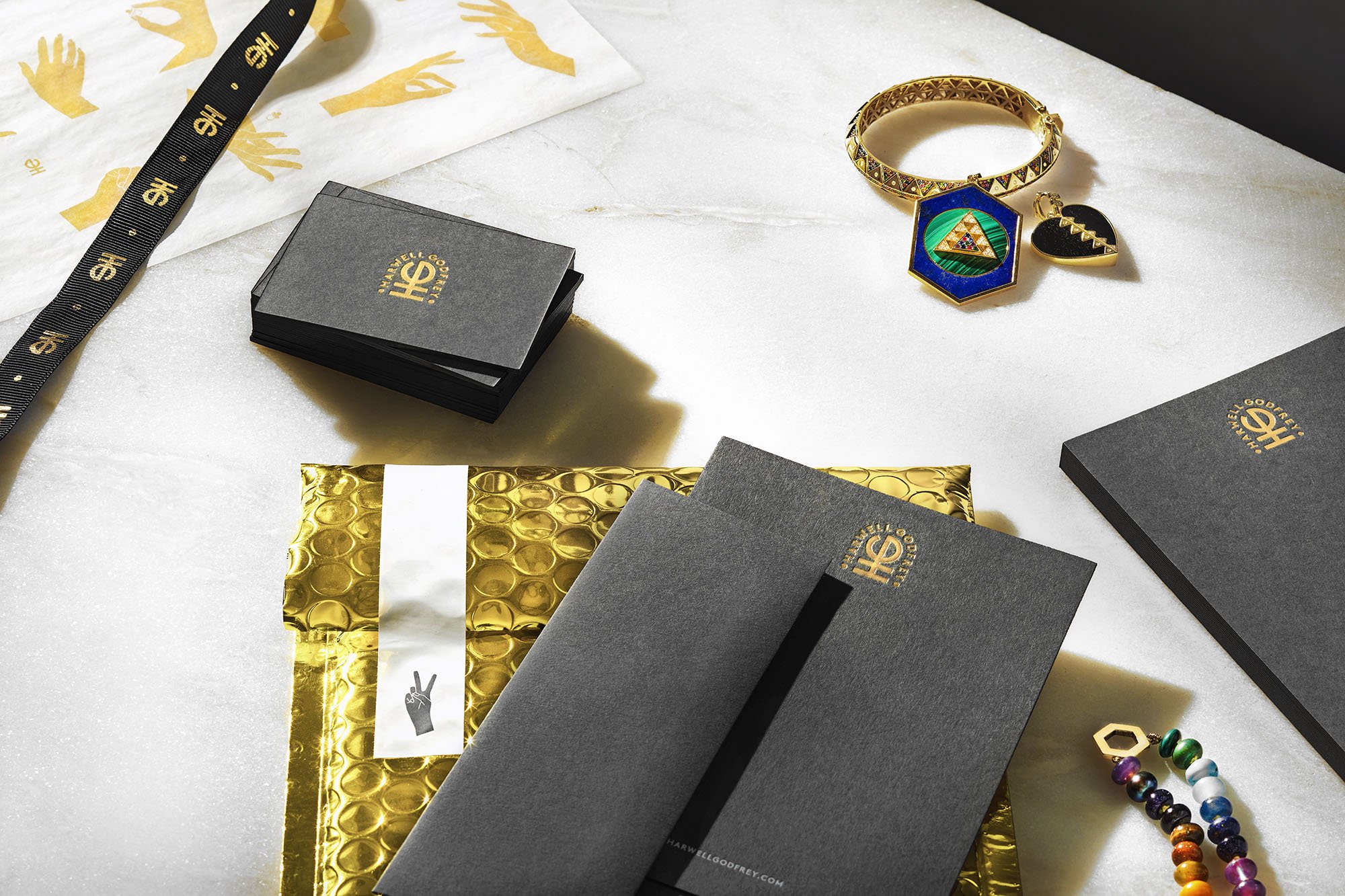
Harwell Godfrey Brand Identity, 2017-2021
Building a custom identity system inspired by the natural roots of Lauren Godfrey’s award-winning fine jewelry collection.
-
Harwell Godfrey is an award-winning fine jewelry brand by founder and designer, Lauren Godfrey. Her collection is deeply inspired by nature, and handcrafted in 18k gold with precious gemstones, distinctive inlay and ethically-sourced diamonds. Lauren won the 2022 Gem Award for jewelry design, and her pieces have been on the covers of Vogue and Cosmopolitan.
-
Before working together, Lauren had an existing monogram with a strong concept; but it lacked a refinement and sense of balance. She came to us looking for a stronger identity system that reflects the style and sophistication of her jewelry. Like her approach to the jewelry, we turned to nature to inspire our design development.
-
AD Joy Scull
Design Joy Scull, Magali Lebon
CD Allie Fisher, Scott Dadich
Portfolio Photography Cera Hensley
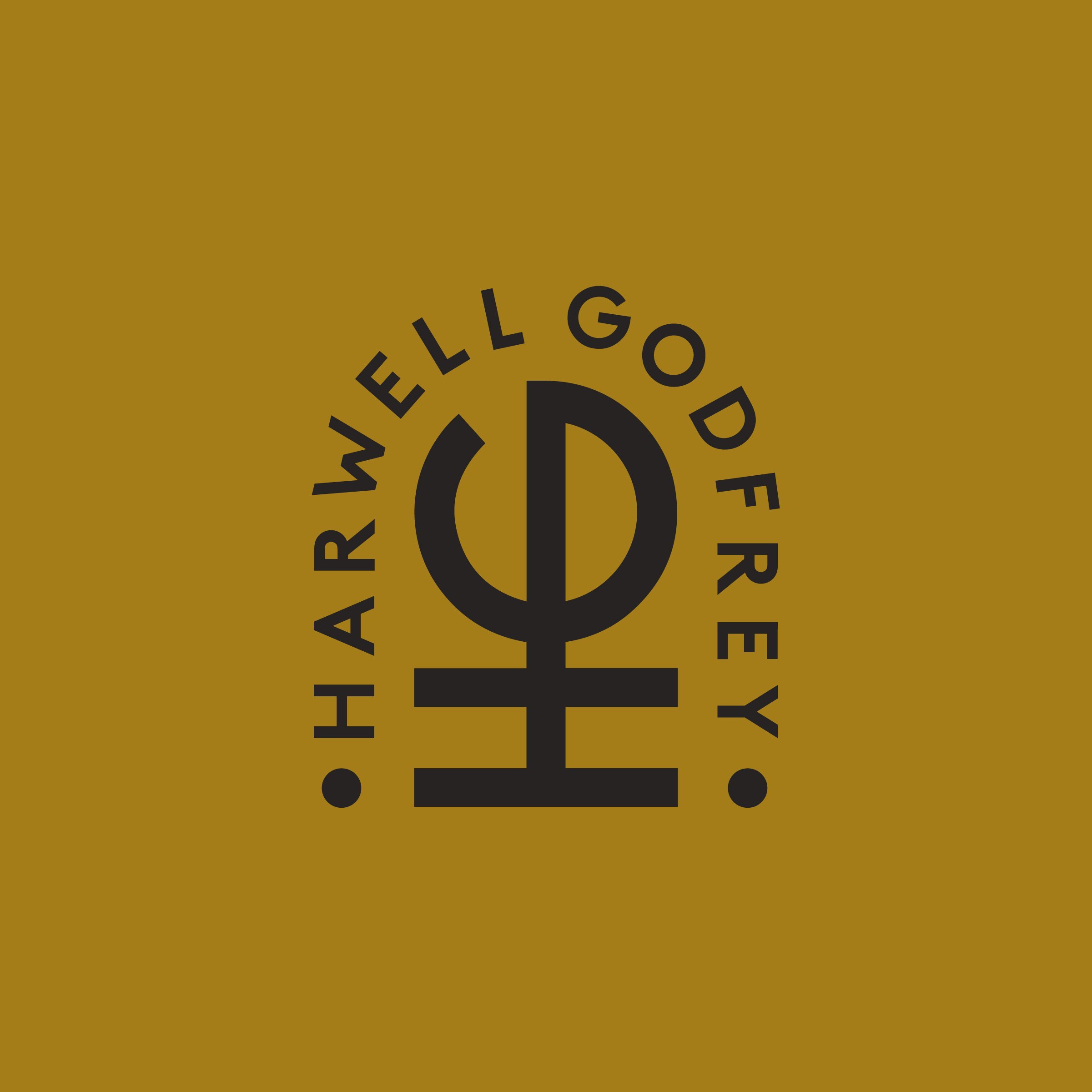
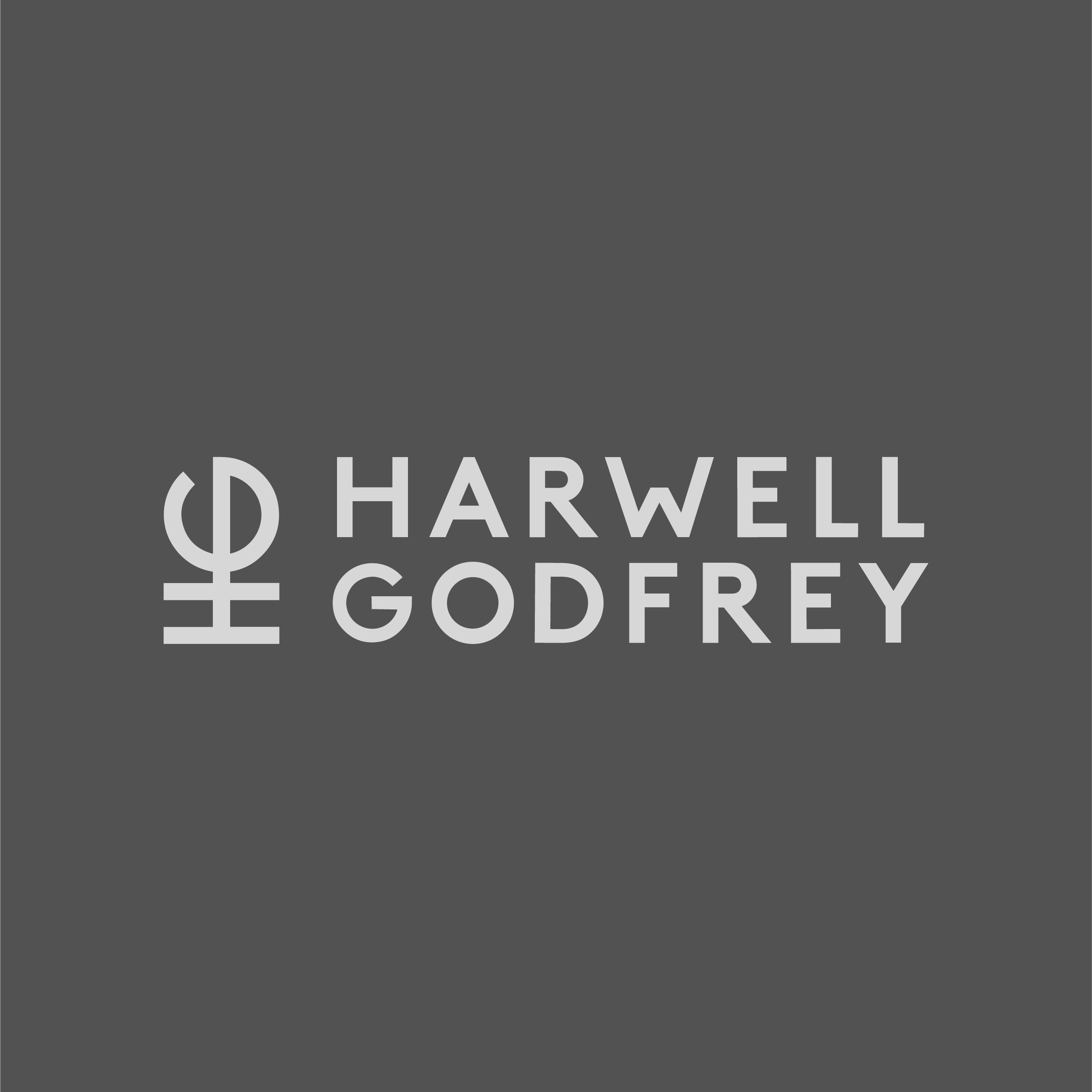
The characters of the primary mark bend to follow the curve of the “G.” The shape mimics the roundness of a necklace, bracelet or ring. We created a few variations of the mark to lend itself to both digital and analog applications.
We built a custom stationary and packaging system that is stylish and protective enough to ship orders worldwide. The color palette is simple: grey stationary, inspired by stone, serves as a backdrop to colorful gemstones. It’s complimented by hints of gold foil that nod to the luxurious material and price point of the brand.
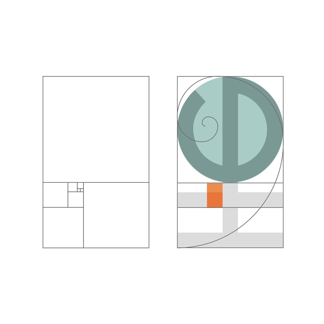

We re-drew Lauren's existing monogram guided by the proportions of the golden ratio: a choice inspired by the brands connection to nature. This created a satisfying proportional mark.


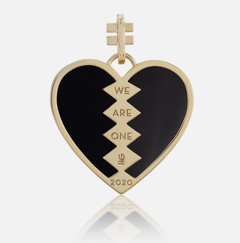
The monogram is flexible enough to scale down to a tiny engraving.
Photos are courtesy of harwellgodfrey.com and @harwellgodfrey


